KAUTRA
Visual Identity Refresh & Fleet Branding System
Brand Identity • Logo Refresh • Fleet Branding • Transportation Design
Overview
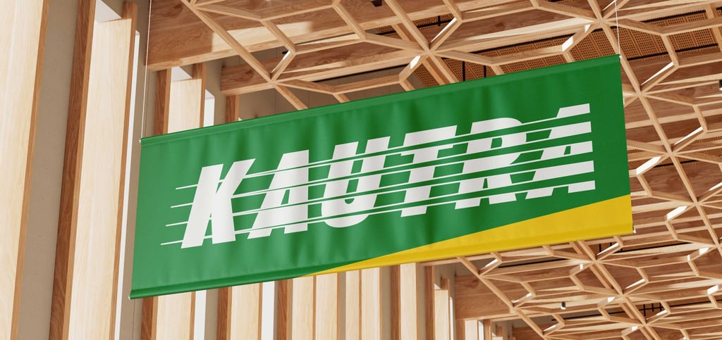
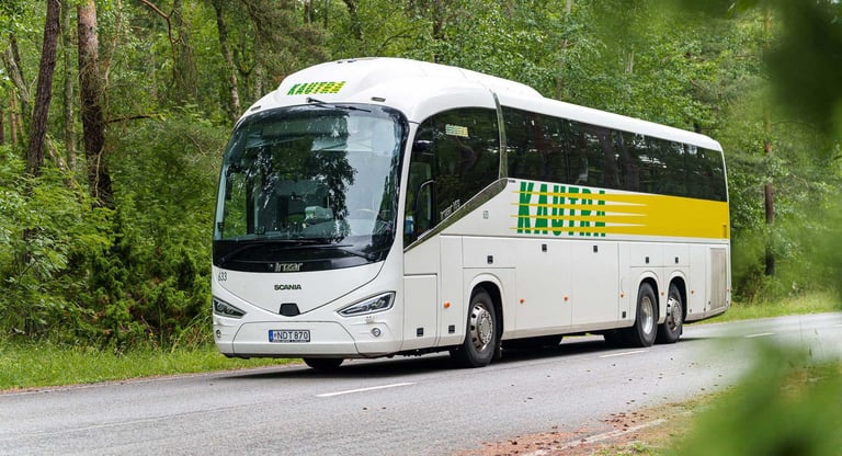
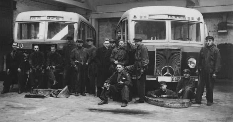
KAUTRA is one of Lithuania's oldest and largest passenger transportation companies, operating since 1934. The project focused on refining the existing visual identity while preserving its strong brand recognition. Beyond the logo refresh, the objective was to establish a scalable fleet branding system capable of unifying different bus models under one consistent visual language.
Client
KAUTRA
PROJECT INFORMATION
Industry
Public Transportation
Role
Lead Designer
Services
Visual Identity Refresh
Fleet Branding
Brand Strategy
Year
2026
Challenge
Rather than creating a completely new identity, the challenge was to modernize an already recognizable brand. Every refinement had to improve readability, scalability and consistency while preserving decades of brand equity.
THE CHALLENGE
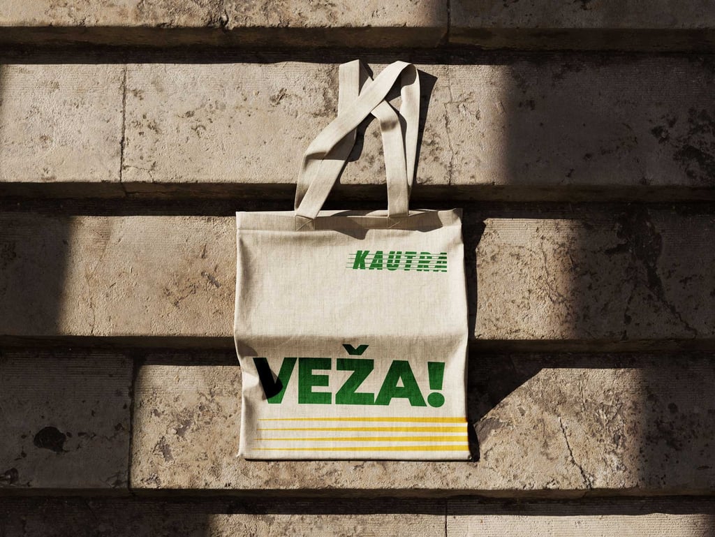
BRAND AUDIT
Weaknesses
Uneven optical spacing
Limited readability at smaller sizes
Inconsistent stripe proportions
Outdated color contrast
Strengths
Strong public recognition
Distinctive motion-inspired character
Memorable green and yellow palette
Long-established visual equity
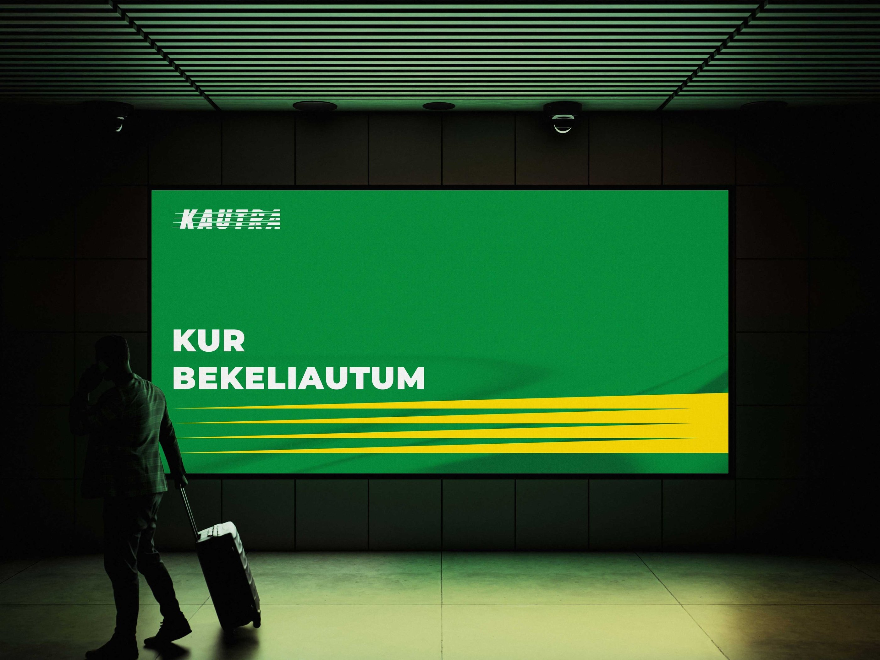
Objectives
Improve optical readability
Refine letter spacing
Optimize the stripe system
Modernize the color palette
Preserve maximum brand recognition


Before / After
Letter spacing
Letterform refinement
Stripe consistency
Updated colors

BEFORE
AFTER
COLOR SYSTEM
#ffd700
R:255 G:215 B:100
C:0 M:13 Y:100 K:0
Pantone Yellow 012 C
RAL 1023
#008e42
R:0 G:142 B:66
C:87 M:19 Y:100 K:5 Pantone 347 C
RAL 6037
#ffffff
R:256 G:256 B:256
C:0 M:0 Y:0 K:0
Pantone White C
RAL 9003
#3a3a3a
R:58 G:58 B:58
C:69 M:62 Y:61 K:52 Pantone 446 C
RAL 9017
KAUTRA Green
KAUTRA Yellow
White
Graphite
LOGO SYSTEM
Logo System
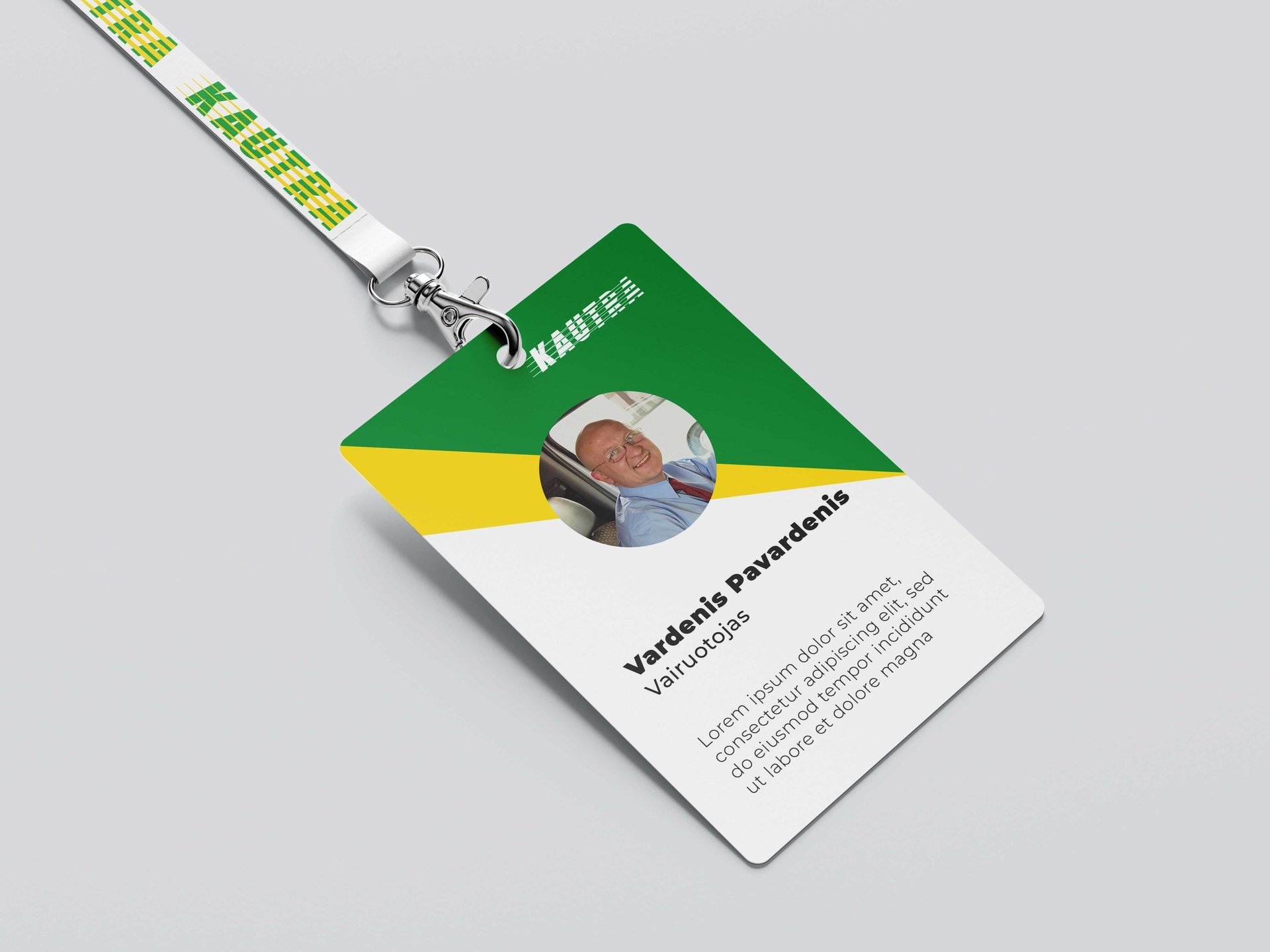
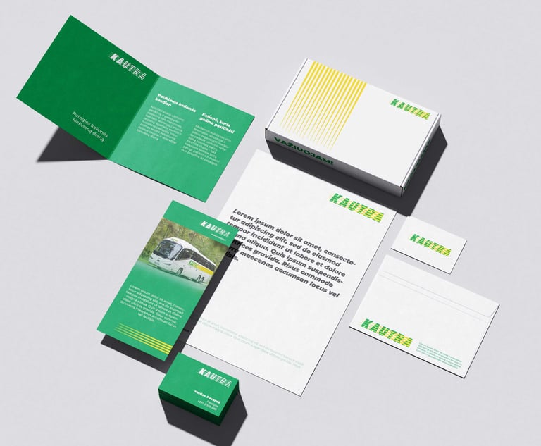
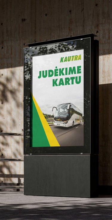
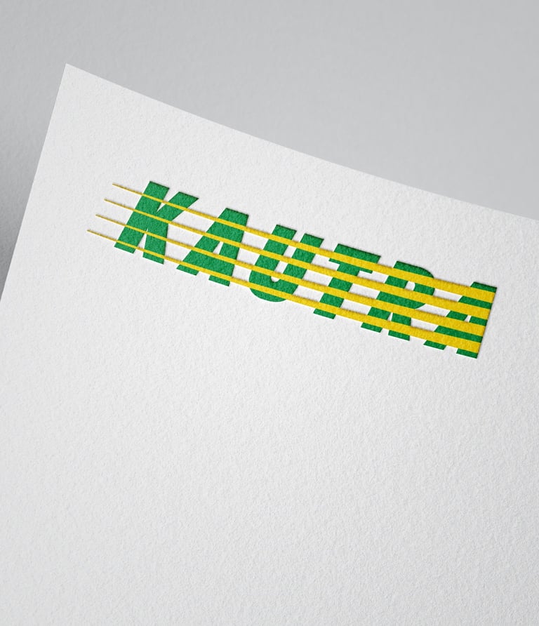
The updated identity was expanded into a flexible logo system, giving KAUTRA a clearer and more practical set of brand assets. In addition to the primary logo, a monochrome version and a standalone icon were developed to support different use cases — from large-scale fleet branding to digital interfaces, documents, signage and small-format applications.
Icon
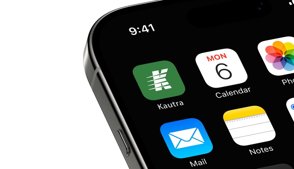
A compact brand mark created for small-scale digital use, social media, app interfaces and favicon applications.
Primary Logo
Used as the main brand mark across key communication and fleet branding.
Monochrome Logo
Designed for situations where color reproduction is limited or stronger contrast is required.